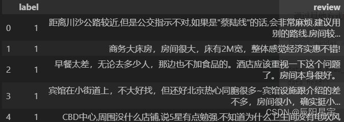
效果演示
实现了一个太阳系动画,其中包括了地球、火星、金星、土星、水星、天王星、海王星以及火卫二号等行星的动画效果。太阳系的行星都被放在一个固定的容器中,并使用CSS动画来实现旋转和移动的效果。当太阳系的行星绕着太阳运行时,它们会围绕太阳旋转,并且在运行过程中会发生碰撞和交叉。
Code
<div class="wrapper"><div class="neptune-container"><img src="img/neptune.png" /></div><div class="uranus-container"><img src="img/uranus.svg" /></div><div class="saturn-container"><img src="img/saturn.png" /></div><div class="jupiter-container"><img src="img/jupiter.png" /></div><div class="mars-container"><img src="img/mars.png" /></div><div class="earth-container"><img src="img/earth.png" /></div><div class="venus-container"><img src="img/venus.png" /></div><div class="mercury-container"><img src="img/mercury.png" /></div><div class="sun-container"><img src="img/sun.png" /></div>
</div>
* {margin: 0;padding: 0;box-sizing: border-box;
}body {display: flex;justify-content: center;align-items: center;height: 100vh;background-image: url(img/space-background.jpg)
}.wrapper {height: 100%;width: 100%;display: flex;justify-content: center;align-items: center;
}.wrapper div {position: absolute;border-radius: 100%;display: flex;justify-content: center;align-items: center;border: 1px solid white;position: absolute;
}.neptune-container {height: 850px;width: 850px;
}.neptune-container>img {height: 50px;width: 50px;animation: neptune-rotation 53954ms linear infinite;
}.uranus-container {height: 750px;width: 750px;
}.uranus-container>img {height: 75px;width: 75px;animation: uranus-rotation 37054ms linear infinite;
}.saturn-container {height: 600px;width: 600px;
}.saturn-container>img {height: 75px;width: 75px;animation: saturn-rotation 33218ms linear infinite;
}.jupiter-container {height: 500px;width: 500px;
}.jupiter-container>img {height: 75px;width: 75px;animation: jupiter-rotation 27339ms linear infinite;
}.mars-container {height: 400px;width: 400px;
}.mars-container>img {height: 35px;width: 35px;animation: mars-rotation 12684ms linear infinite;
}.earth-container {height: 350px;width: 350px;
}.earth-container>img {height: 30px;width: 30px;animation: earth-rotation 11079ms linear infinite;
}.venus-container {height: 300px;width: 300px;
}.venus-container>img {height: 20px;width: 20px;animation: venus-rotation 7259ms linear infinite;
}.mercury-container {height: 250px;width: 250px;
}.mercury-container>img {height: 15px;width: 15px;animation: mercury-rotation 5768ms linear infinite;
}.sun-container {height: 200px;width: 200px;border-radius: 100%;display: flex;justify-content: center;align-items: center;
}.sun-container>img {height: 310px;width: 310px;
}@keyframes neptune-rotation {0% {transform: rotate(0deg) translate(425px) rotate(0deg);}100% {transform: rotate(360deg) translate(425px) rotate(360deg);}
}@keyframes uranus-rotation {0% {transform: rotate(0deg) translate(375px) rotate(0deg);}100% {transform: rotate(360deg) translate(375px) rotate(360deg);}
}@keyframes saturn-rotation {0% {transform: rotate(0deg) translate(300px) rotate(0deg);}100% {transform: rotate(360deg) translate(300px) rotate(360deg);}
}@keyframes jupiter-rotation {0% {transform: rotate(0deg) translate(250px) rotate(0deg);}100% {transform: rotate(360deg) translate(250px) rotate(360deg);}
}@keyframes mars-rotation {0% {transform: rotate(0deg) translate(200px) rotate(0deg);}100% {transform: rotate(360deg) translate(200px) rotate(360deg);}
}@keyframes earth-rotation {0% {transform: rotate(0deg) translate(175px) rotate(0deg);}100% {transform: rotate(360deg) translate(175px) rotate(360deg);}
}@keyframes venus-rotation {0% {transform: rotate(0deg) translate(150px) rotate(0deg);}100% {transform: rotate(360deg) translate(150px) rotate(360deg);}
}@keyframes mercury-rotation {0% {transform: rotate(0deg) translate(125px) rotate(0deg);}100% {transform: rotate(360deg) translate(125px) rotate(360deg);}
}
实现思路拆分
* {margin: 0;padding: 0;box-sizing: border-box;
}
这段代码是设置全局样式,包括设置元素的盒模型为border-box,即盒模型的宽度和高度包括内容、内边距、边框和外边距。
body {display: flex;justify-content: center;align-items: center;height: 100vh;background-image: url(img/space-background.jpg)
}
这段代码是设置整个页面的样式,包括设置页面的高度为100vh,即视口的高度,使页面填充整个屏幕。同时,设置页面的背景图片为space-background.jpg。
.wrapper {height: 100%;width: 100%;display: flex;justify-content: center;align-items: center;
}
这段代码是设置一个容器的样式,包括设置容器的高度和宽度为100%,使容器填充整个屏幕。同时,设置容器的显示方式为flex,使容器中的元素可以自动排列。
.wrapper div {position: absolute;border-radius: 100%;display: flex;justify-content: center;align-items: center;border: 1px solid white;position: absolute;
}
这段代码是设置太阳系中的行星的样式,包括设置行星的位置为绝对定位,使其相对于容器的位置进行定位。同时,设置行星的圆角半径为100%,使其变成一个圆形。设置行星的显示方式为flex,使其中的元素可以自动排列。设置行星的边框为1px solid white,使其看起来像一个白色的圆形。
.neptune-container {height: 850px;width: 850px;
}.neptune-container>img {height: 50px;width: 50px;animation: neptune-rotation 53954ms linear infinite;
}
这段代码是设置尼普斯星的样式,包括设置行星的高度和宽度为850px,使其变成一个圆形。同时,设置行星的动画效果为neptune-rotation,即使用CSS动画实现行星的旋转效果。
.uranus-container {height: 750px;width: 750px;
}.uranus-container>img {height: 75px;width: 75px;animation: uranus-rotation 37054ms linear infinite;
}
这段代码是设置乌拉斯星的样式,包括设置行星的高度和宽度为750px,使其变成一个圆形。同时,设置行星的动画效果为uranus-rotation,即使用CSS动画实现行星的旋转效果。
.saturn-container {height: 600px;width: 600px;
}.saturn-container>img {height: 75px;width: 75px;animation: saturn-rotation 33218ms linear infinite;
}
这段代码是设置土星的样式,包括设置行星的高度和宽度为600px,使其变成一个圆形。同时,设置行星的动画效果为saturn-rotation,即使用CSS动画实现行星的旋转效果。
.jupiter-container {height: 500px;width: 500px;
}.jupiter-container>img {height: 75px;width: 75px;animation: jupiter-rotation 27339ms linear infinite;
}
这段代码是设置木星的样式,包括设置行星的高度和宽度为500px,使其变成一个圆形。同时,设置行星的动画效果为jupiter-rotation,即使用CSS动画实现行星的旋转效果。
.mars-container {height: 400px;width: 400px;
}
这段代码是设置火星的样式,包括设置行星的高度和宽度为400px,使其变成一个圆形。
.mars-container>img {height: 35px;width: 35px;animation: mars-rotation 12684ms linear infinite;
}
这段代码是设置火星的图片样式,包括设置图片的高度和宽度为35px,使其变成一个圆形。同时,设置图片的动画效果为mars-rotation,即使用CSS动画实现行星的旋转效果。
.earth-container {height: 350px;width: 350px;
}
这段代码是设置地球的样式,包括设置行星的高度和宽度为350px,使其变成一个圆形。
.earth-container>img {height: 30px;width: 30px;animation: earth-rotation 11079ms linear infinite;
}
这段代码是设置地球的图片样式,包括设置图片的高度和宽度为30px,使其变成一个圆形。同时,设置图片的动画效果为earth-rotation,即使用CSS动画实现行星的旋转效果。
.venus-container {height: 300px;width: 300px;
}
这段代码是设置金星的样式,包括设置行星的高度和宽度为300px,使其变成一个圆形。
.venus-container>img {height: 20px;width: 20px;animation: venus-rotation 7259ms linear infinite;
}
这段代码是设置金星的图片样式,包括设置图片的高度和宽度为20px,使其变成一个圆形。同时,设置图片的动画效果为venus-rotation,即使用CSS动画实现行星的旋转效果。
.mercury-container {height: 250px;width: 250px;
}
这段代码是设置水星的样式,包括设置行星的高度和宽度为250px,使其变成一个圆形。
.mercury-container>img {height: 15px;width: 15px;animation: mercury-rotation 5768ms linear infinite;
}
这段代码是设置水星的图片样式,包括设置图片的高度和宽度为15px,使其变成一个圆形。同时,设置图片的动画效果为mercury-rotation,即使用CSS动画实现行星的旋转效果。
.sun-container {height: 200px;width: 200px;border-radius: 100%;display: flex;justify-content: center;align-items: center;
}
这段代码是设置太阳的样式,包括设置行星的高度和宽度为200px,使其变成一个圆形。同时,设置行星的圆角半径为100%,使其变成一个圆形。设置行星的显示方式为flex,使其中的元素可以自动排列。设置行星的居中方式为居中对齐,使其在容器中居中显示。
.sun-container>img {height: 310px;width: 310px;
}
这段代码是设置太阳的图片样式,包括设置图片的高度和宽度为310px,使其变成一个圆形。
@keyframes neptune-rotation {0% {transform: rotate(0deg) translate(425px) rotate(0deg);}100% {transform: rotate(360deg) translate(425px) rotate(360deg);}
}
这段代码是定义了一个名为neptune-rotation的CSS动画,用于实现尼普斯星的旋转动画。该动画包含两个关键帧,分别为0%和100%。在0%时,尼普斯星的旋转角度为0度,并向右移动425px。在100%时,尼普斯星的旋转角度为360度,并向右移动425px。
@keyframes uranus-rotation {0% {transform: rotate(0deg) translate(375px) rotate(0deg);}100% {transform: rotate(360deg) translate(375px) rotate(360deg);}
}
这段代码是定义了一个名为uranus-rotation的CSS动画,用于实现乌拉斯星的旋转动画。该动画包含两个关键帧,分别为0%和100%。在0%时,乌拉斯星的旋转角度为0度,并向右移动375px。在100%时,乌拉斯星的旋转角度为360度,并向右移动375px。
@keyframes saturn-rotation {0% {transform: rotate(0deg) translate(300px) rotate(0deg);}100% {transform: rotate(360deg) translate(300px) rotate(360deg);}
}
这段代码是定义了一个名为saturn-rotation的CSS动画,用于实现土星的旋转动画。该动画包含两个关键帧,分别为0%和100%。在0%时,土星的旋转角度为0度,并向右移动300px。在100%时,土星的旋转角度为360度,并向右移动300px。
@keyframes jupiter-rotation {0% {transform: rotate(0deg) translate(250px) rotate(0deg);}100% {transform: rotate(360deg) translate(250px) rotate(360deg);}
}
这段代码是定义了一个名为jupiter-rotation的CSS动画,用于实现木星的旋转动画。该动画包含两个关键帧,分别为0%和100%。在0%时,木星的旋转角度为0度,并向右移动250px。在100%时,木星的旋转角度为360度,并向右移动250px。
@keyframes mars-rotation {0% {transform: rotate(0deg) translate(200px) rotate(0deg);}100% {transform: rotate(360deg) translate(200px) rotate(360deg);}
}
这段代码是定义了一个名为mars-rotation的CSS动画,用于实现火星的旋转动画。该动画包含两个关键帧,分别为0%和100%。在0%时,火星的旋转角度为0度,并向右移动200px。在100%时,火星的旋转角度为360度,并向右移动200px。
@keyframes earth-rotation {0% {transform: rotate(0deg) translate(175px) rotate(0deg);}100% {transform: rotate(360deg) translate(175px) rotate(360deg);}
}
这段代码是设置地球的动画效果,包括设置动画的名称为earth-rotation,即使用CSS动画实现地球的旋转效果。在0%时,将地球的位置设置为0deg,并将其向右移动175px。在100%时,将地球的位置设置为360deg,并将其向右移动175px。
@keyframes venus-rotation {0% {transform: rotate(0deg) translate(150px) rotate(0deg);}100% {transform: rotate(360deg) translate(150px) rotate(360deg);}
}
这段代码是设置金星的动画效果,包括设置动画的名称为venus-rotation,即使用CSS动画实现金星的旋转效果。在0%时,将金星的位置设置为0deg,并将其向右移动150px。在100%时,将金星的位置设置为360deg,并将其向右移动150px。
@keyframes mercury-rotation {0% {transform: rotate(0deg) translate(125px) rotate(0deg);}100% {transform: rotate(360deg) translate(125px) rotate(360deg);}
}
这段代码是设置水星的动画效果,包括设置动画的名称为mercury-rotation,即使用CSS动画实现水星的旋转效果。在0%时,将水星的位置设置为0deg,并将其向右移动125px。在100%时,将水星的位置设置为360deg,并将其向右移动125px。

![【C++入门到精通】智能指针 [ C++入门 ]](https://img-blog.csdnimg.cn/direct/108d10fb122e41ad9888d25090dcca19.png#pic_center)