永不示弱
重点 (Top highlight)
Philippe Starck, a renowned industrial designer, once said:
著名的工业设计师Philippe Starck曾经说过:
“A designer has a duty to create timeless design. To be timeless you have to think really far into the future, not next year, not in two years but in 20 years minimum.”
“设计师有责任创造永恒的设计。 要永不过时,您必须考虑真正的未来,而不是明年,不是两年,而是至少20年。”
Born in 1990, I witnessed the internet evolve from text to immersive audio-visual experiences. And throughout, I wondered—can design be timeless on such a fast-changing medium as the web?
我出生于1990年,我见证了互联网从文本到沉浸式视听体验的演变。 在整个过程中, 我都想知道-在如此快速变化的媒体(如网络)上,设计是否永不过时?
Starck’s own website unfortunately wasn’t up in 2000, but archive.org has preserved landing pages of many other agencies of the day.
不幸的是,斯塔克自己的网站没有在2000年启用,但是archive.org保留了当今许多其他代理商的登录页面。
Are you ready to jump into the time machine, shed a tear of nostalgia, and see if their designs would speak to the audiences of today?
您准备好跳入时光机,怀旧之情,看看它们的设计是否可以与今天的观众交流?
设计工作室 (Design studios)
Many of the top design agencies today were founded long before personal computers and the web. As such, they had to consciously transition from print, to the Internet.
当今许多顶级设计机构的建立早于个人计算机和网络的建立。 因此,他们必须有意识地从印刷过渡到互联网。
五角星 (Pentagram)
London
伦敦
Pentagram, founded in 1972, is the world’s largest independently-owned design studio. Its list of past and present partners includes such stars as Alan Fletcher, Bob Gill, Paula Scher, and Michael Bierut.
Pentagram成立于1972年,是世界上最大的独立设计工作室。 它过去和现在的合作伙伴名单包括Alan Fletcher,Bob Gill,Paula Scher和Michael Bierut等明星。
Pentagram’s 2000 website was written in Adobe ColdFusion Markup, and like many websites of the day, tried to replicate print design elements on the web.
Pentagram的2000年网站是使用Adobe ColdFusion Markup编写的,并且与当今的许多网站一样,试图在网络上复制印刷设计元素。
The menu, drop cap, titles, and image captions are pixel-perfect low-resolution GIFs. The columns — hand-crafted with <td> tags.
菜单,首字下沉,标题和图像标题是像素完美的低分辨率GIF。 列-用<td>标签手工制作。
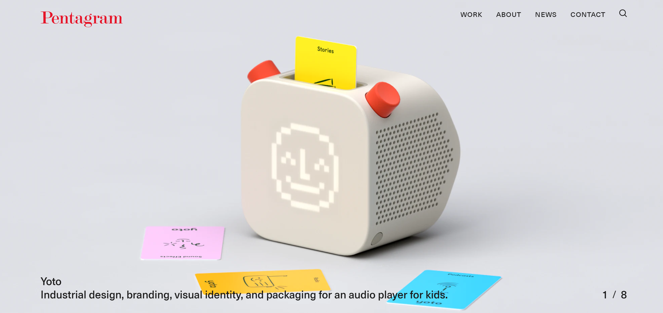
In 2020, the Pentagram logo remains unchanged, but the website went from all text, to all image, letting the studio’s work speak for itself.
在2020年, 五角星形徽标保持不变,但网站从所有文字变为所有图片,使工作室的工作不言自明。
元设计 (MetaDesign)
Berlin
柏林
MetaDesign, founded in 1979, is behind such iconic projects as the Berlin Transit System (BVG).
MetaDesign成立于1979年,其背后的标志性项目包括柏林公交系统(BVG)。
True to their name, MetaDesign also worked on several meta projects, such as Apple’s macOS design system, and the Adobe brand.
就像他们的名字一样,MetaDesign还参与了多个元项目,例如Apple的macOS设计系统和Adobe品牌。
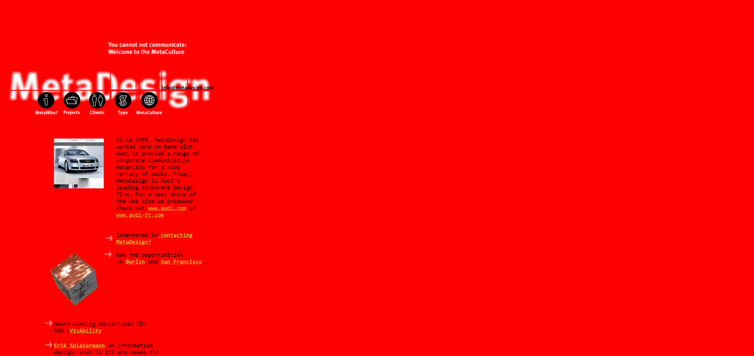
MetaDesign’s 2000 website went all-in on cutting-edge features of the day, including a Gaussian-blurred logo, and a rotating 3D cube (a GIF, of course).
MetaDesign的2000网站全天候关注最先进的功能,包括高斯模糊的徽标和旋转的3D立方体(当然是GIF)。
Not displayed below, the site ends with a veritable signature of the era:
该网站未显示在下方,以真实的时代签名结尾:
Copyright ©1995–98 MetaDesign. All rights reserved.webmaster@metadesign.com Last modified — Nov. 11, 1998
版权所有©1995–98 MetaDesign。 版权所有。 webmaster@metadesign.com 上次修改时间-1998年11月11日
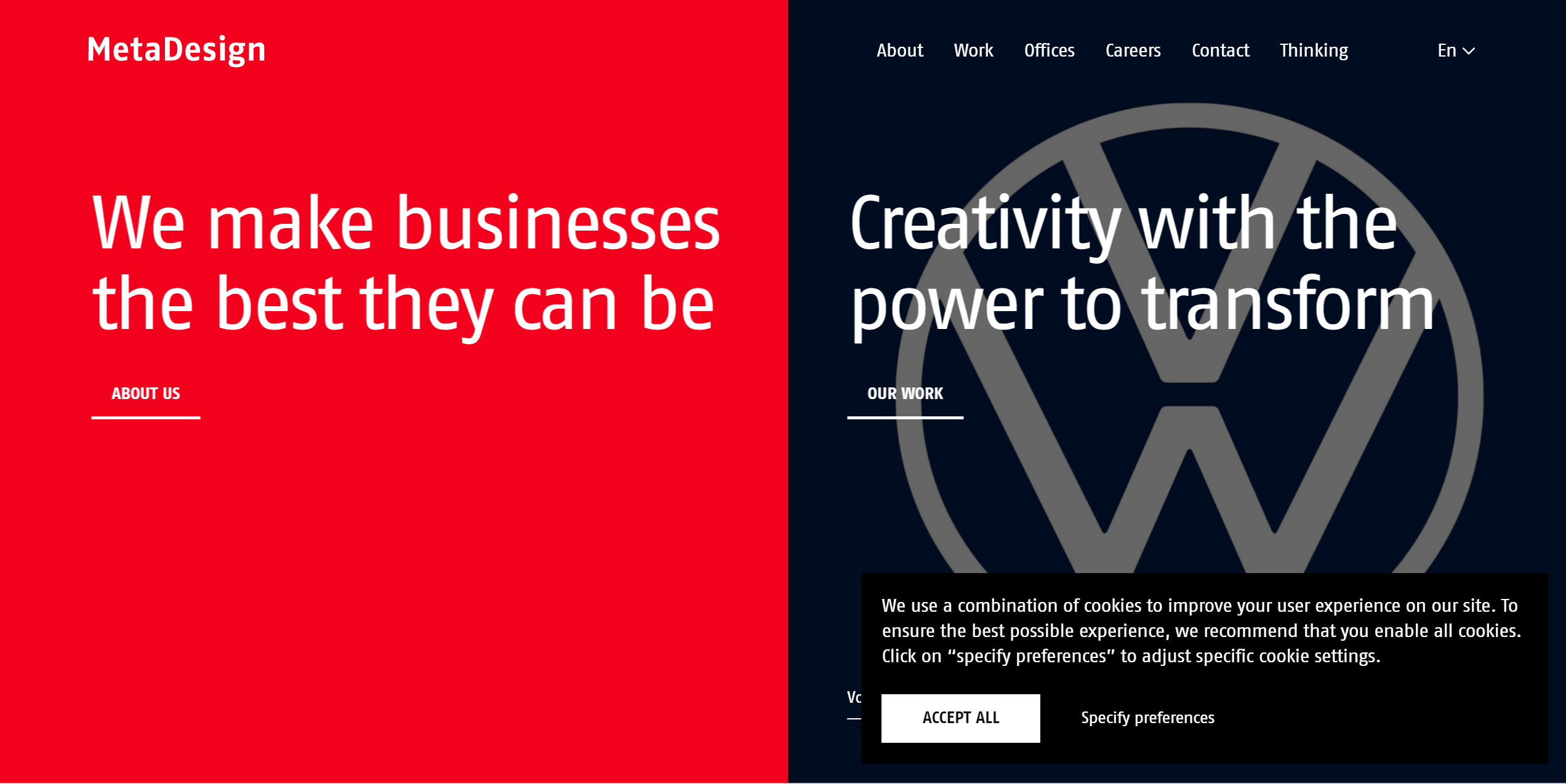
MetaDesign’s 2020 website pays tribute to the original swathe of red, but also gives attention to usability — large fonts, and WCAG 2.1-compliant contrast.
MetaDesign的2020网站向原始的红色致敬,但同时也关注可用性(大字体和符合WCAG 2.1的对比度)。
Of course, it’s also covered by a cookie warning — the signature of this age!
当然,它也包含cookie警告- 这个时代的签名!
兰多 (Landor)
San Francisco
旧金山
Landor is a brand consulting firm started in 1941, one of the first to apply consumer research to design.
Landor是一家品牌咨询公司,成立于1941年,是最早将消费者研究应用于设计的公司之一。
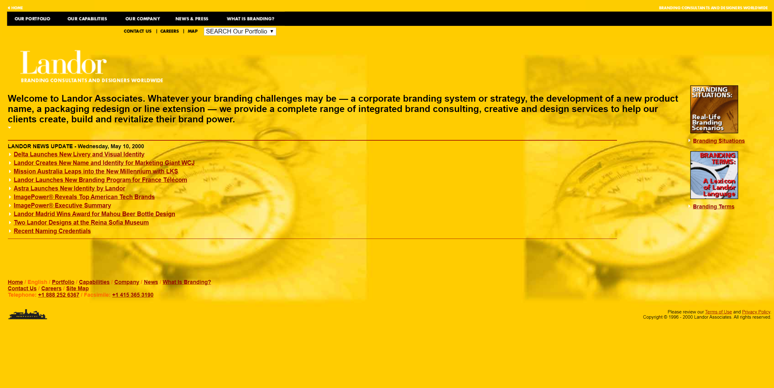
Walter Landor used to say that “the package itself must do the talking.” It is therefore surprising to see how wordy their website was in year 2000.
沃尔特·兰多(Walter Landor)过去曾说过:“包装本身必须进行交流。” 因此,令人惊讶的是看到他们的网站在2000年有多么word琐。
The pre-Google SEARCH Our Portfolio dropdown is in fact a list of all the sections of the website.
Google之前的“ 搜索我们的投资组合”下拉列表实际上是网站所有部分的列表。
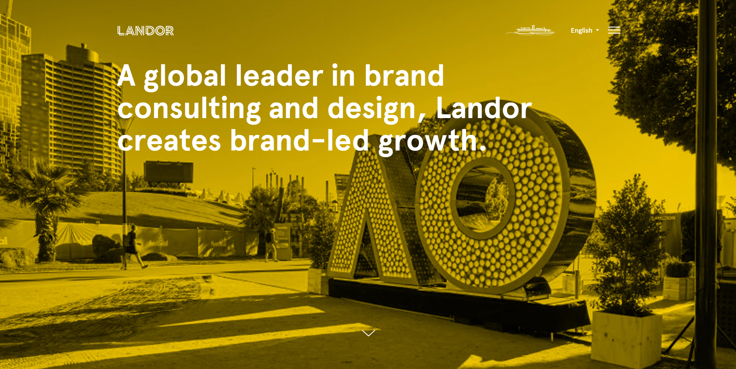
The background image and silhouette in the footer reference the ferry boat Klamath, which Landor used as headquarters from the 1960s to the 1980s.
页脚中的背景图像和轮廓以渡轮克拉马斯(Klamath)为参考, 该船在1960年代至1980年代被Landor用作总部。
Landor’s 2020 website maintains the yellow colour scheme, but streamlines both the logotype, and the ferry boat icon.
Landor的2020网站保留了黄色配色方案,但简化了徽标和渡船图标。
Like Pentagram, Landor puts the visual of their work front (back?) and center.
像五角星形一样,Landor将工作的视觉置于正面(背面?)和中心。
快乐齿轮 (Happy Cog)
New York
纽约
Happy Cog is one of the first digital-native agencies, started in 1999 by Jeffrey Zeldman, the founder of A List Apart.
Happy Cog是最早的数字原生广告公司之一,由A List Apart的创始人Jeffrey Zeldman于1999年创立。
The original website of Happy Cog might not win any design awards, but unlike others on this list, it was written in W3C-standard HTML (Zeldman was an early proponent of web standards).
Happy Cog的原始网站可能不会赢得任何设计大奖,但与该列表上的其他网站不同,它是使用W3C标准HTML编写的(Zeldman是Web标准的早期支持者)。
It is also the only website on the list to make use of JavaScript, updating windows.status, and animating menu items on hover:
它也是列表中唯一使用JavaScript,更新windows.status以及在悬停时设置动画菜单项的网站:
onmouseover=”window.status=’Our work, and welcome to it.’; changeImages(‘projects’, ‘botdex/projects_over.gif’); return true;”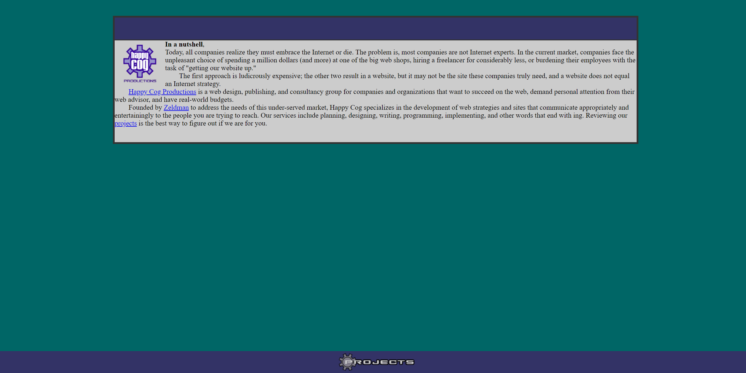
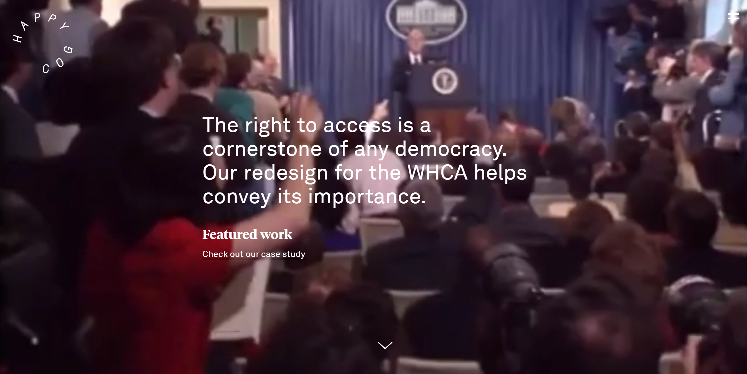
Happy Cog’s 2020 website continues a familiar pattern — visuals of their work in the background, overlaid with oversized type, and a minimalist logo.
Happy Cog的2020网站继续采用一种熟悉的模式-在后台显示其工作的视觉效果,并覆盖了超大字体和极简主义徽标。
青蛙 (Frog)
San Francisco
旧金山
Frog is a design consultancy founded in Germany, in 1969.
Frog是一家设计咨询公司,于1969年在德国成立。
They soon moved to Palo Alto, and are best known for their work on Apple IIc, and the Snow White design language used by Apple from 1984 to 1990.
他们很快搬到了帕洛阿尔托(Palo Alto),并以在Apple IIc上的工作以及在1984年至1990年间Apple使用的Snow White设计语言而闻名。
Remember Flash? Good.
还记得Flash吗? 好。
Remember Shockwave?
还记得Shockwave吗?
Frog’s website was built using this multimedia platform, which was already then giving up market share to Flash (both owned by Macromedia).
Frog的网站是使用此多媒体平台构建的,该平台当时已经放弃了Flash的市场份额(两者均由Macromedia拥有)。
This also meant a static welcome page asking visitors to download a browser plug-in, before they could access even just the studio’s contact details.
这也意味着一个静态的欢迎页面,要求访问者下载浏览器插件,然后才可以访问工作室的联系方式。
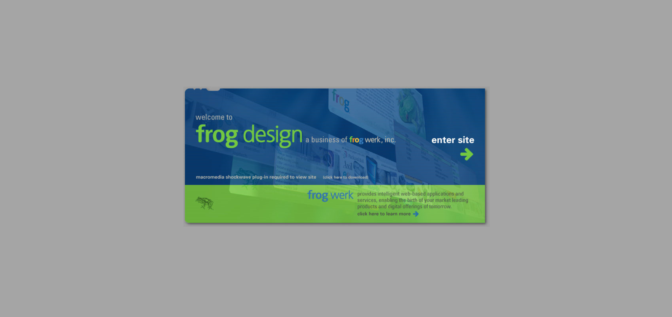
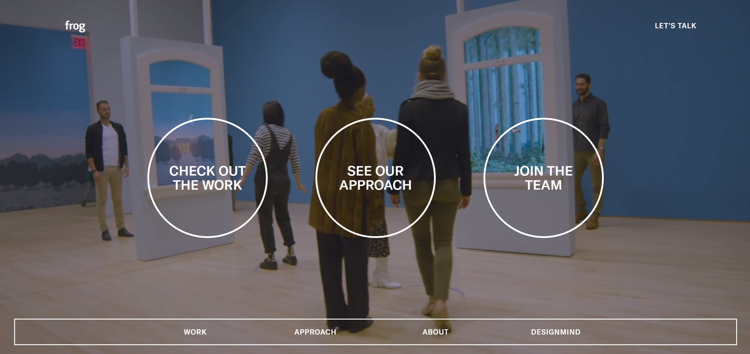
Frog’s 2020 website follows the crowd with a visual background, but chooses to forgo the slogan, and overlay the video with navigation instead.
Frog的2020网站以视觉背景跟随人群,但选择放弃口号,而是将视频覆盖导航。
艺术。 列别杰夫 (Art. Lebedev)
Moscow
莫斯科
Art. Lebedev, founded in 1995, is by far the best known Russian studio.
艺术。 列别捷夫(Lebedev)成立于1995年,是迄今为止最著名的俄罗斯工作室。
Today, they specialize in urban navigation and industrial design, such as their award-winning Moscow Metro map and signage.
如今,他们专注于城市导航和工业设计,例如屡获殊荣的莫斯科地铁地图和标牌。
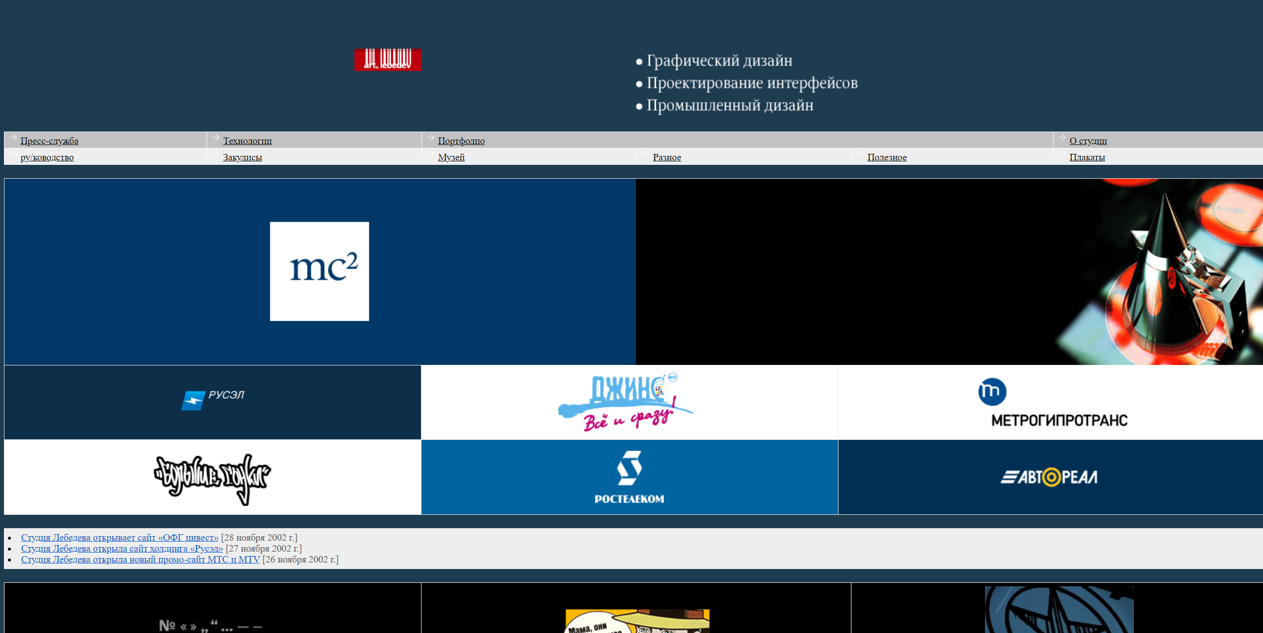
Back in the day, however, the studio was still focused on branding and interface design, with what can only be described as hit-and-miss results.
然而,在过去,工作室仍然专注于品牌和界面设计,只能说是一击而败。
Not displayed below is a footer with the most 1990’s feature yet: A counter bragging about six million visitors to the website!
下面没有显示的是带有1990年最多功能的页脚:一个吹牛网站的访问者!
Счетчик посетителей: 6224079
Счетчикпосетителей:6224079
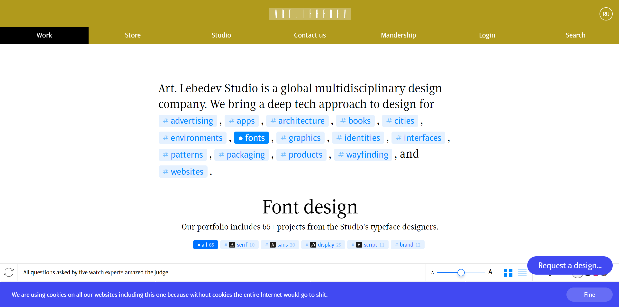
Art. Lebedev’s 2020 website is a real breath of fresh air in portfolio design.
艺术。 列别捷夫(Lebedev )的2020年网站是投资组合设计中真正的新鲜空气。
Out: Full-page images, videos, and pretentious taglines.
Out:整页图像,视频和自定义标语。
In: Intuitive navigation, and a cookie permissions box that wins the day:
在:直观的导航,以及赢得这一天的Cookie权限框:
We are using cookies on all our websites including this one because without cookies the entire Internet would go to shit.
我们在包括该网站在内的所有网站上使用cookie,因为如果没有cookie,整个Internet都会被淘汰。
型铸造厂 (Type foundries)
With the advent of web fonts, great web design became inseparable from type. Which brings up the question — What web presence did foundries have before cloud typography became the norm?
随着Web字体的出现,出色的Web设计变得与字体密不可分。 哪个提出了问题-在云印刷成为规范之前,代工厂拥有哪些网站?
移民 (Emigre)
Berkeley
伯克利
Emigre, founded in 1984, is the first foundry to design typefaces for and on a computer, as well as the first to sell their fonts online.
Emigre成立于1984年,是第一家为计算机设计字体并在计算机上设计字体的铸造厂,并且是第一家在线出售字体的工厂。
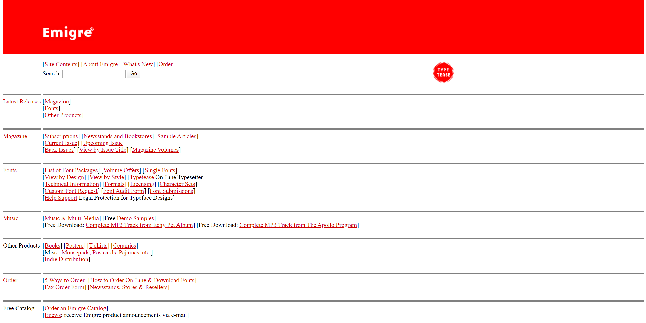
Emigre’s 2000 homepage was surprisingly barebones, more like a web directory than a portfolio site.
Emigre的2000年主页令人惊讶地是准系统,更像一个网络目录,而不是一个投资组合网站。
It compensated with hi-tech features such as Typetease, which let customers preview characters from their fonts.
它补充了Typetease等高科技功能,使客户可以预览其字体中的字符。
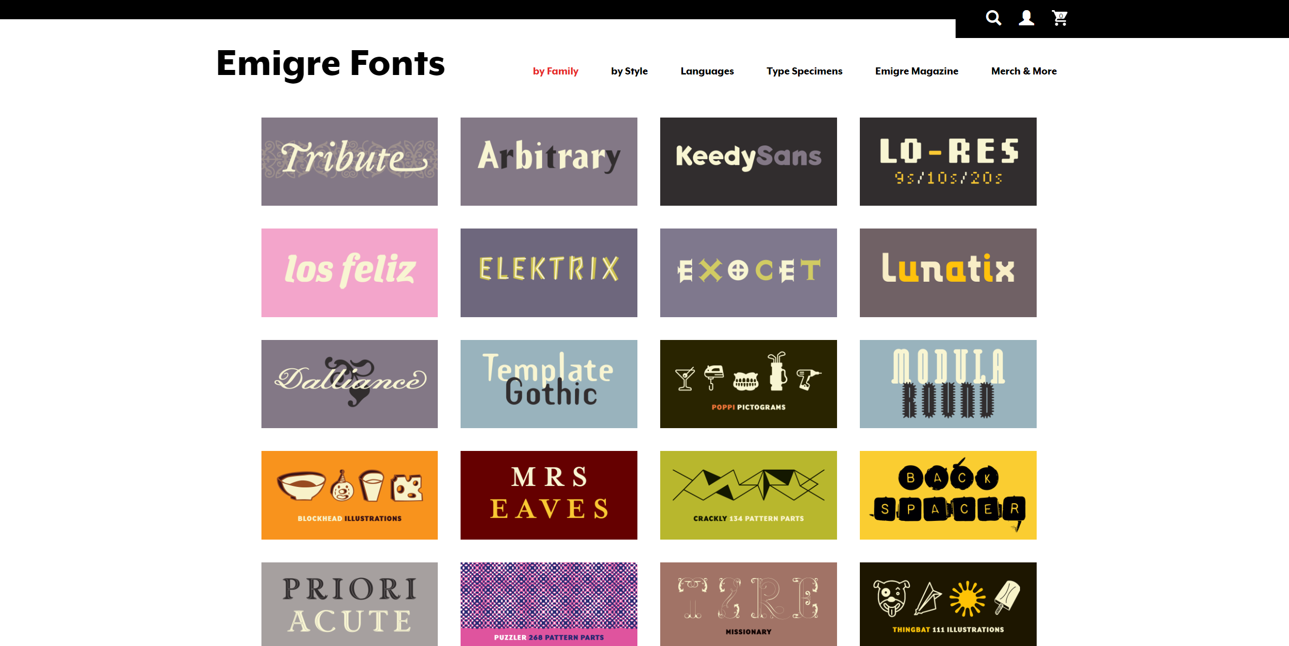
By 2020, Emigre did a one-eighty on the millennial design, replacing the wall of text with a much more inviting wall of specimens of their fonts.
到2020年,Emigre在千禧年设计上做了八十分之一,用更具吸引力的字体标本代替了文字墙。
房屋行业 (House Industries)
Delaware
特拉华州
Founded in 1993, House Industries is one of the best known digital type foundries.
House Industries成立于1993年,是最著名的数字类型铸造厂之一。
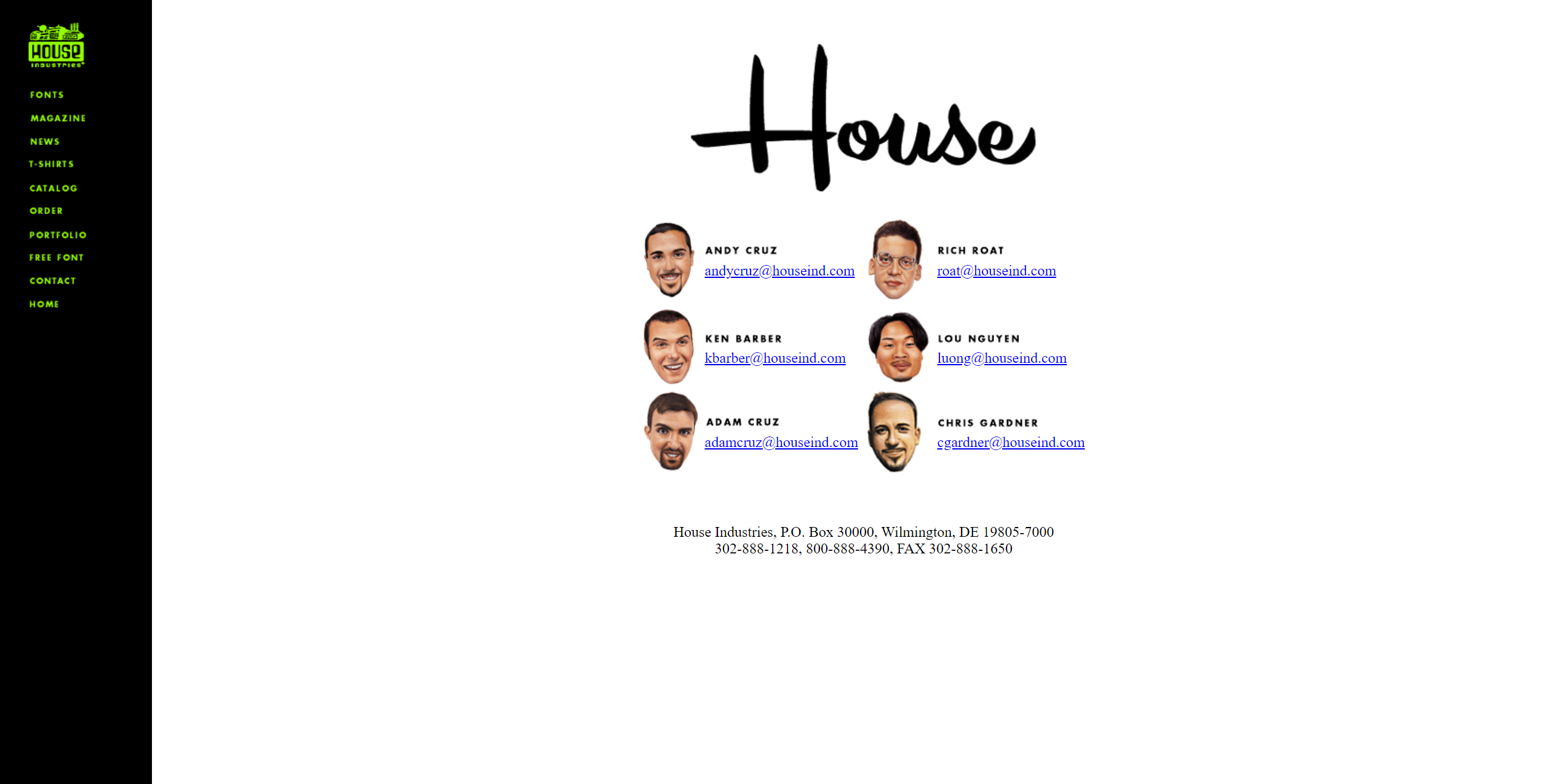
They went for a fun, minimalist style in 2000, embedding various typefaces as GIFs throughout the site.
他们在2000年追求一种有趣的极简风格,将各种字体作为GIF嵌入整个网站。
My favourite part? The contact page which wouldn’t feel out of place on a hipster startup website of today.
我最喜欢的部分? 在当今的时髦创业网站上,您不会感到不适的联系页面。
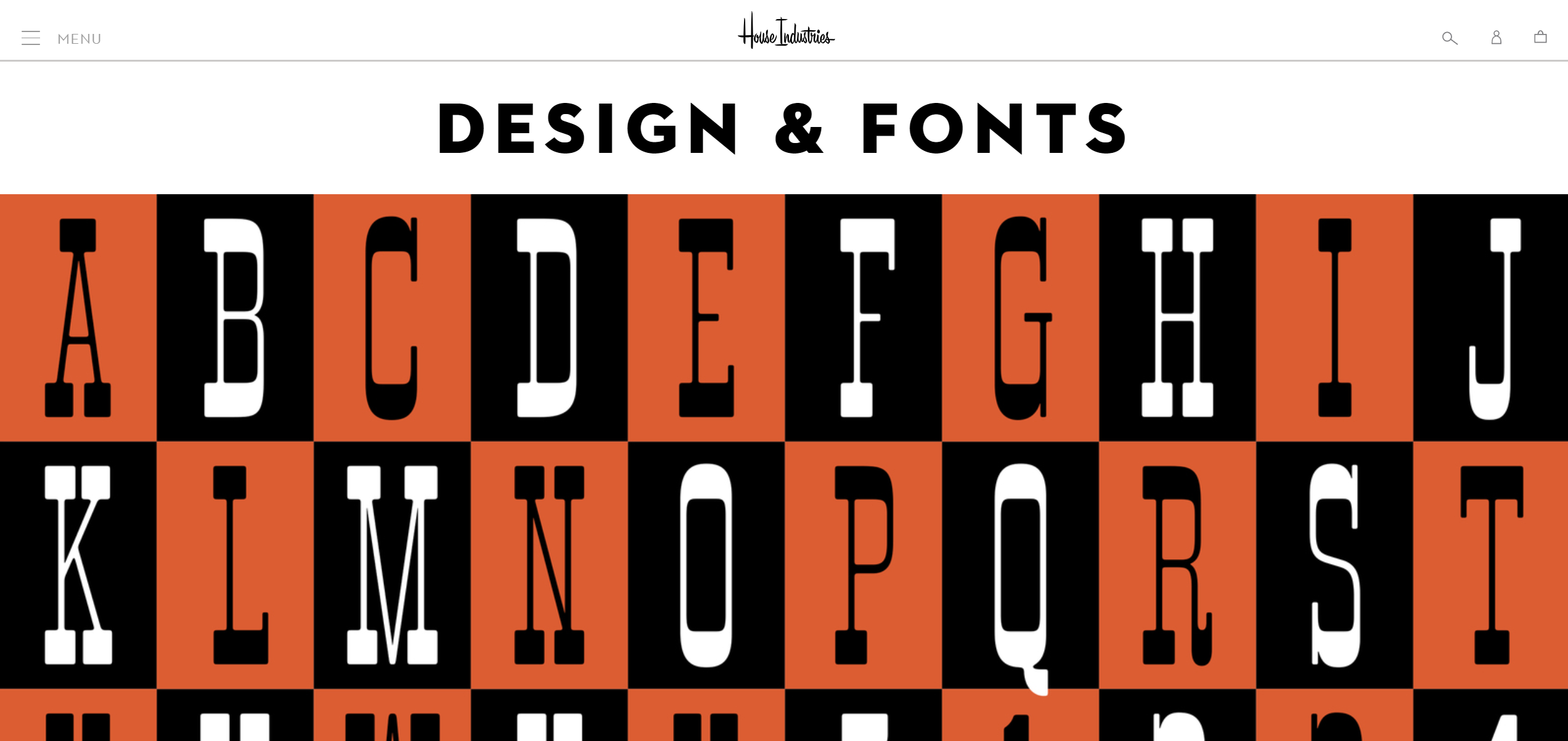
In 2020, House Industries website still puts the typefaces front and centre. The cute factory logo and signature humour are unfortunately long gone.
在2020年, House Industries网站仍将字体放在前面和中间。 不幸的是,可爱的工厂徽标和签名幽默早已荡然无存。
霍夫勒公司 (Hoefler&Co.)
New York
纽约
The Hoefler Type Foundry, started in 1989, designed such iconic typefaces as Archer, Gotham, and Whitney.
成立于1989年的Hoefler Type Foundry设计了标志性字体,例如Archer,Gotham和Whitney。
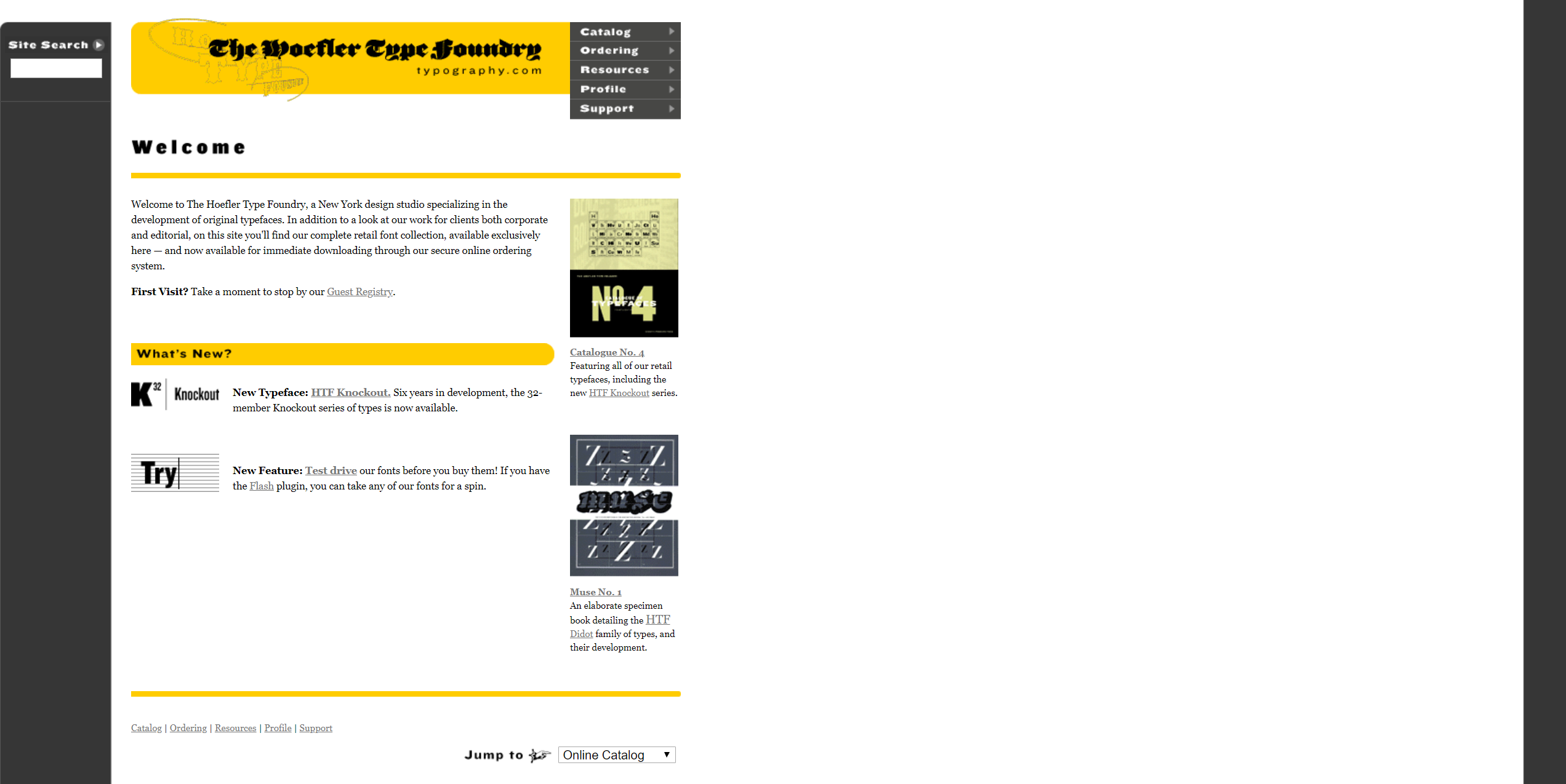
They’re also the lucky owners of the typography.com domain, which in 2000 hosted a surprisingly modern site, with full-text search, and a Flash app for customers to try their fonts.
他们还是typography.com域的幸运所有者,该域在2000年托管了一个令人惊讶的现代网站,具有全文搜索功能,以及一个Flash应用程序供客户试用其字体。
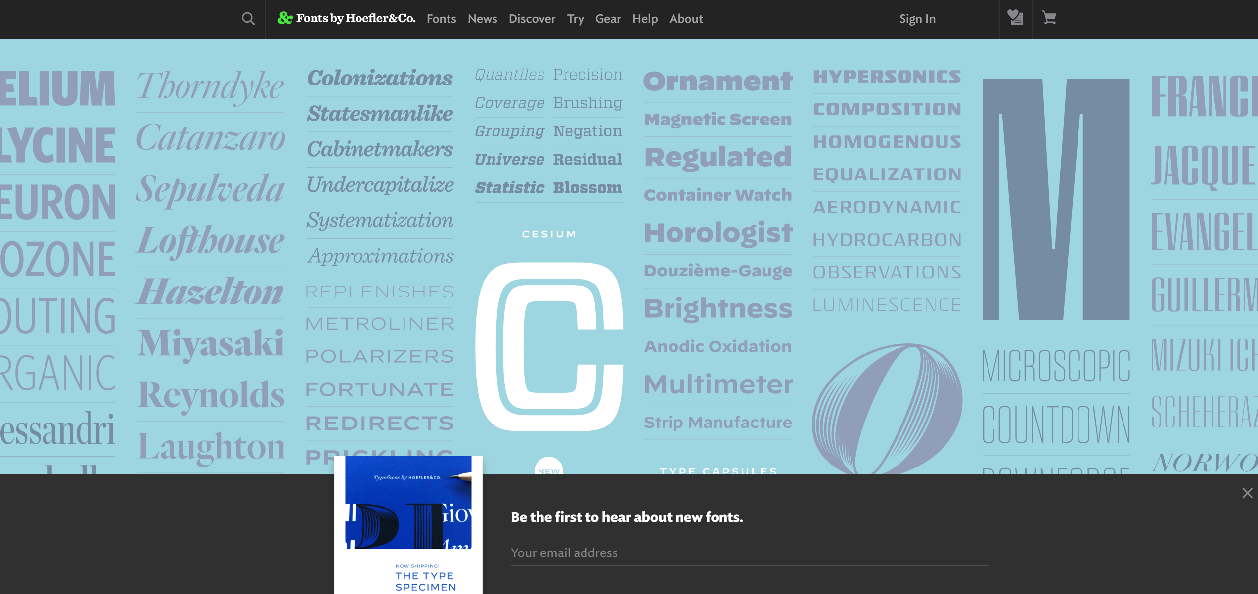
H&Co.’s 2020 site features a stunning masonry of specimens of their fonts.
H&Co。 在2020年的网站上,其字体标本令人惊叹。
奖金:工具制造商 (Bonus: Toolmakers)
While great artists can mesmerize the world with nothing but a piece of charcoal and a wall, design is inseparable from the medium, and the tools.
伟大的艺术家仅凭一根木炭和一堵墙就能使世界着迷,但设计与媒介和工具密不可分。
土坯 (Adobe)
San Jose
圣荷西
Although new alternatives have appeared in recent years, such as InVision, Sketch and Figma, most design professionals continue to use Adobe software on a daily basis.
尽管近年来出现了新的替代方案,例如InVision,Sketch和Figma,但大多数设计专业人员仍每天都在使用Adobe软件。
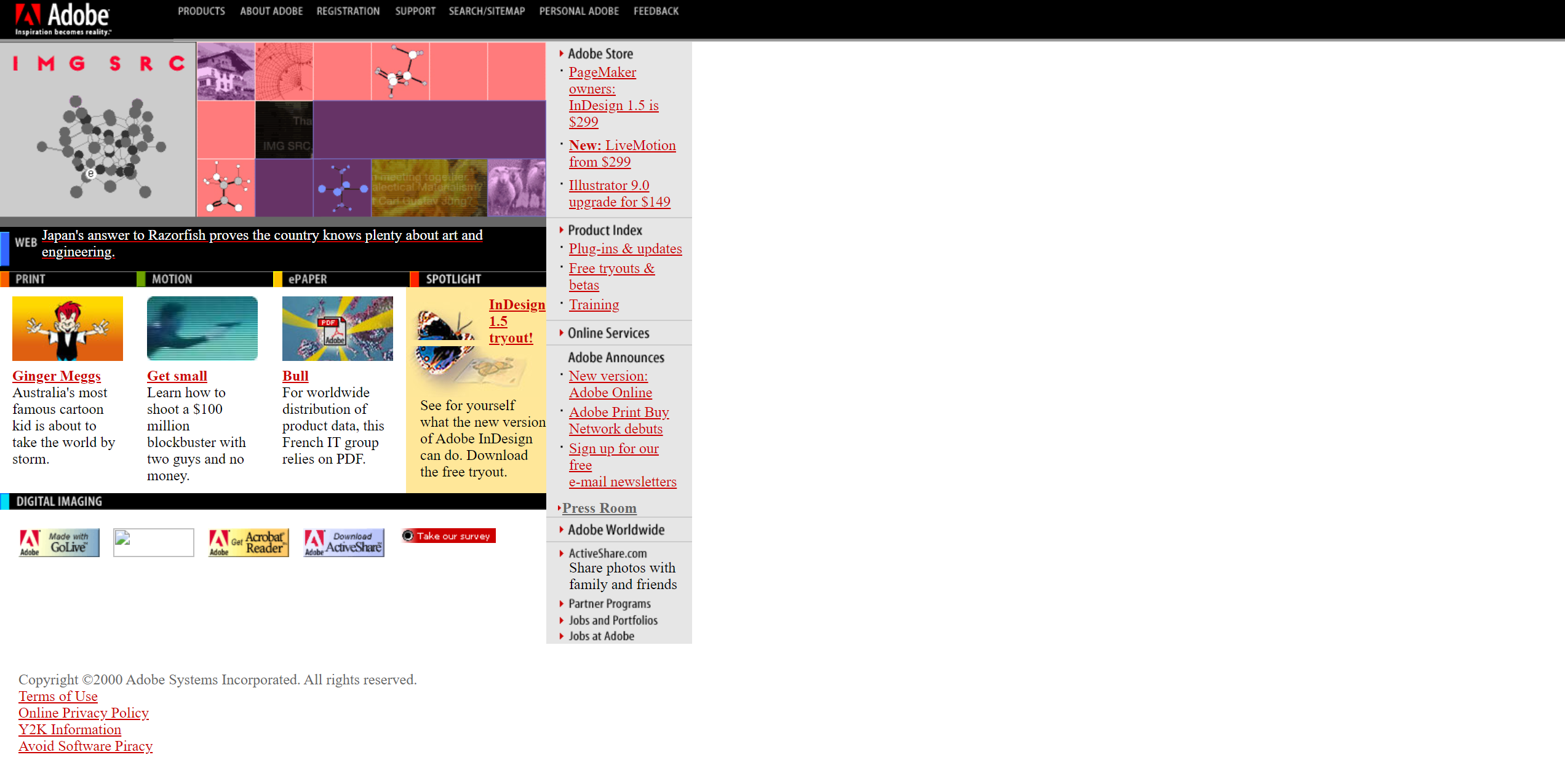
Adobe’s 2000 website shows that already then, the company had offerings across all aspects of print, audio-visual, and web design.
Adobe 2000的网站显示,从那时起,该公司已经提供了涵盖印刷,视听和网页设计各个方面的产品。
For another kick of millennial nostalgia, notice the colourful Made with badges, and the Y2K Information link in the footer.
如果想再次体验千禧一代的怀旧情调,请注意五颜六色的Made with badges和页脚中的Y2K Information链接。
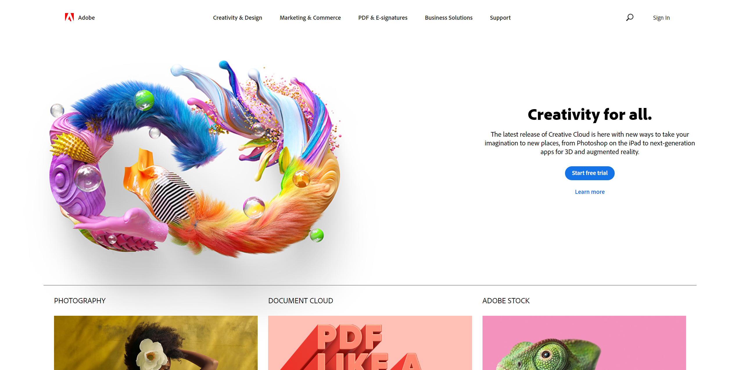
The 2020 website goes for a clean style focused on new features, and the amazing works created using Adobe software.
2020年网站采用简洁风格,侧重于新功能以及使用Adobe软件创建的惊人作品。
苹果 (Apple)
Cupertino
库比蒂诺
Apple was a pioneer of print-quality type & graphics on personal computers, and most design professional continue to rely on their trusty Macs.
苹果公司是个人计算机上打印质量的字体和图形的先驱,大多数设计专业人士继续依赖可信赖的Mac。
Apple’s 2000 website clearly shows their focus on creatives, featuring a prosumer camera connected to a PowerBook.
Apple的2000网站清楚地表明了他们对创意的关注,其特色是将与ProBook相连的专业相机。
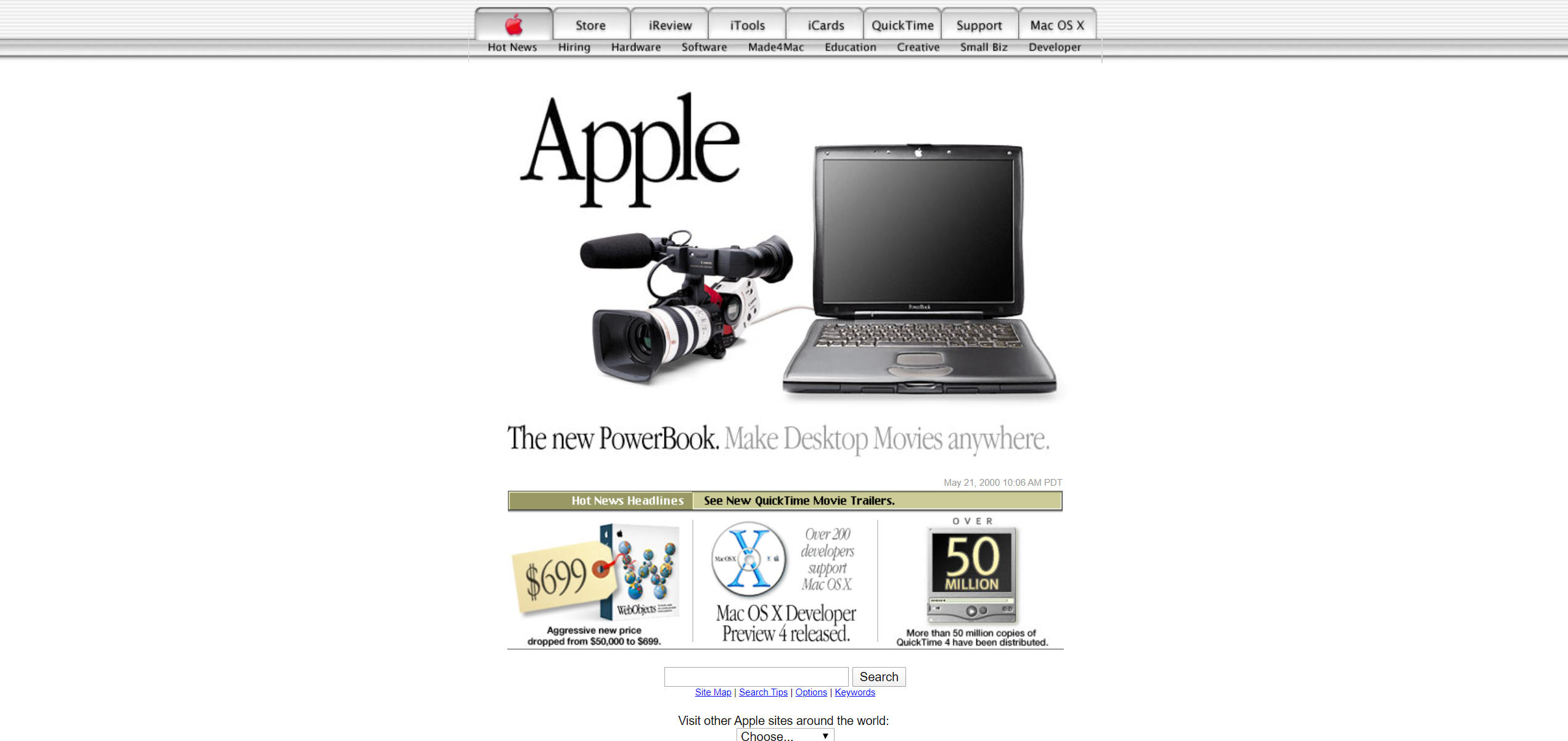
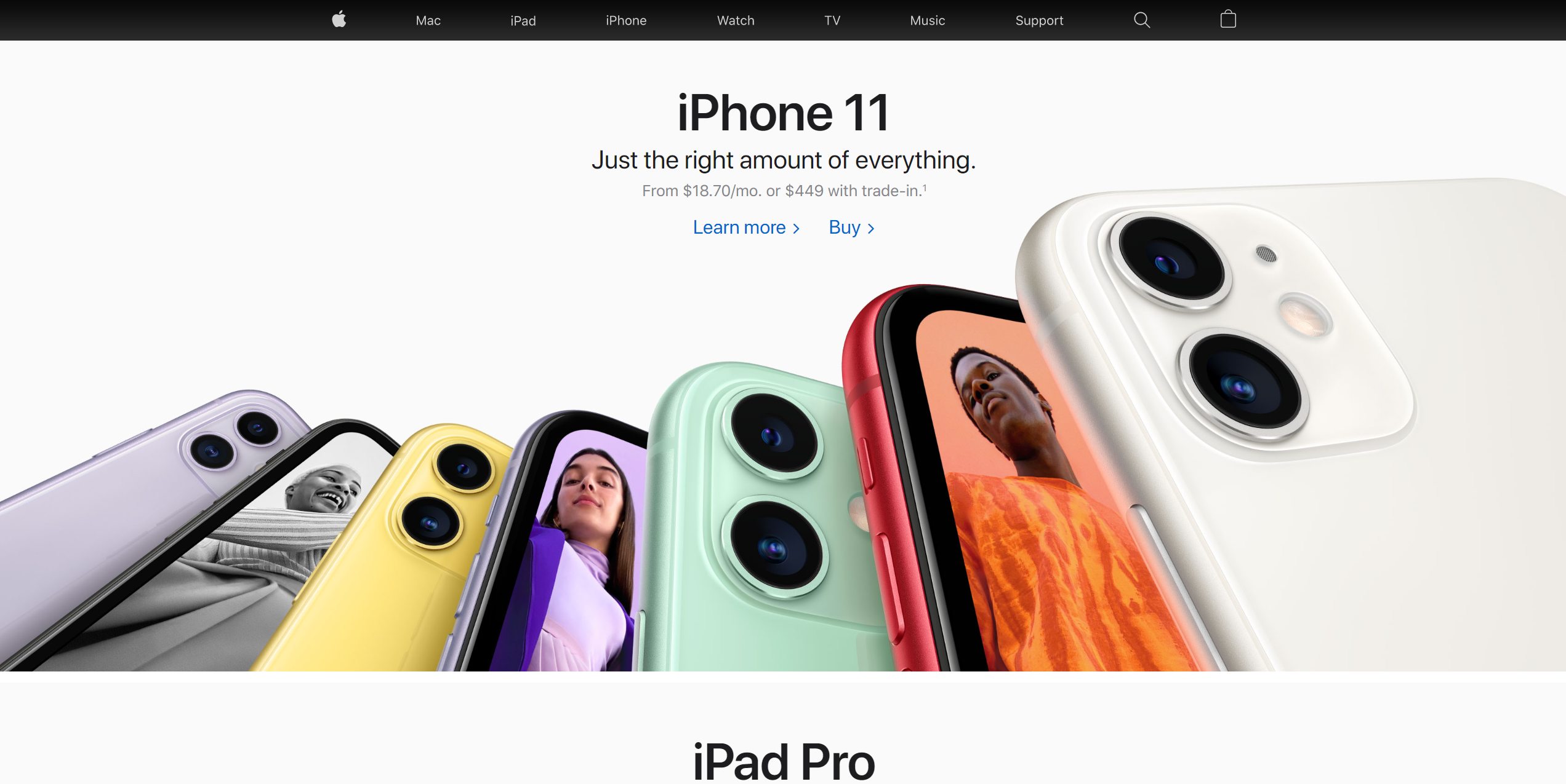
The 2020 website maintains the overall aesthetic, but gives up on fake glass, and serif fonts. Apple’s focus on the creative industry is also less obvious, now the iPhone is behind most of the company’s growth.
2020网站保留了整体美感,但放弃了假玻璃和衬线字体。 苹果公司对创意产业的关注也不太明显,现在iPhone落后于公司的大部分增长。
Although it’s nice to see how far we have progressed in usability, accessibility, and interaction design, there’s something sad about the lack of creativity that came along with these improvements.
尽管很高兴看到我们在可用性,可访问性和交互设计方面取得了长足的进步,但对于这些改进带来的缺乏创造力的情况,我们感到有些遗憾。
All agencies on the list, with the notable exception of Art.Lebedev, use such predictable templates that one would struggle to tell the five apart.
名单上的所有代理机构,除了Art.Lebedev以外,都使用了这种可预测的模板,以至于很难区分这五个模板。
As for my original question: Is timeless design really possible on the web?
至于我最初的问题: 永恒的设计真的可以在网络上进行吗?
I’ll let you share your verdict in the comments!
我会让您在评论中分享您的判断!
翻译自: https://uxdesign.cc/timeless-web-design-online-portfolios-today-and-in-year-2000-234ff5612bb9
永不示弱
本文来自互联网用户投稿,该文观点仅代表作者本人,不代表本站立场。本站仅提供信息存储空间服务,不拥有所有权,不承担相关法律责任。如若转载,请注明出处:http://www.mzph.cn/news/274943.shtml
如若内容造成侵权/违法违规/事实不符,请联系多彩编程网进行投诉反馈email:809451989@qq.com,一经查实,立即删除!


