一.数据查看
数据集地址,用红白酒为例.
import pandas as pd
import matplotlib.pyplot as plt
from mpl_toolkits.mplot3d import Axes3D
import matplotlib as mpl
import numpy as np
import seaborn as snswhite_wine = pd.read_csv('winequality-white.csv', sep=';')
red_wine = pd.read_csv('winequality-red.csv', sep=';')# store wine type as an attribute
red_wine['wine_type'] = 'red'
white_wine['wine_type'] = 'white'# bucket wine quality scores into qualitative quality labels
red_wine['quality_label'] = red_wine['quality'].apply(lambda value: 'low'if value <= 5 else 'medium'if value <= 7 else 'high')
red_wine['quality_label'] = pd.Categorical(red_wine['quality_label'],categories=['low', 'medium', 'high'])
white_wine['quality_label'] = white_wine['quality'].apply(lambda value: 'low'if value <= 5 else 'medium'if value <= 7 else 'high')
white_wine['quality_label'] = pd.Categorical(white_wine['quality_label'],categories=['low', 'medium', 'high'])# merge red and white wine datasets
wines = pd.concat([red_wine, white_wine])# print('wines.head()\n', wines.head())
# re-shuffle records just to randomize data points
wines = wines.sample(frac=1, random_state=42).reset_index(drop=True)
print('wines.head()\n', wines.head())subset_attributes = ['residual sugar', 'total sulfur dioxide', 'sulphates','alcohol', 'volatile acidity', 'quality']
rs = round(red_wine[subset_attributes].describe(), 2)
ws = round(white_wine[subset_attributes].describe(), 2)rs_ws = pd.concat([rs, ws], axis=1, keys=['Red Wine Statistics', 'White Wine Statistics'])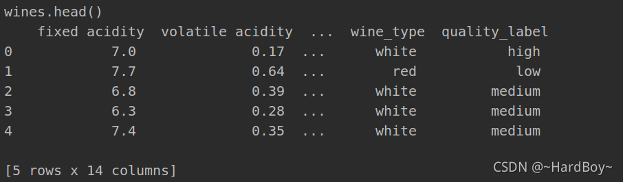
二.数据分析
1.每个特性 都做直方图
wines.hist(bins=15, color='steelblue', edgecolor='black', linewidth=1.0,xlabelsize=8, ylabelsize=8, grid=False, figsize=(12.8, 9.6))
# plt.tight_layout(rect=(0, 0, 1.2, 1.2))
plt.savefig('./wines_analysis.jpg')
2.sulphates属性做直方图和核密度估计
fig = plt.figure(figsize=(6, 4))
title = fig.suptitle("Sulphates Content in Wine", fontsize=14)
fig.subplots_adjust(top=0.85, wspace=0.3)ax = fig.add_subplot(1, 1, 1)
ax.set_xlabel("Sulphates")
ax.set_ylabel("Frequency")
ax.text(1.2, 800, r'$\mu$='+str(round(wines['sulphates'].mean(), 2)),fontsize=12)
freq, bins, patches = ax.hist(wines['sulphates'], color='steelblue', bins=15,edgecolor='black', linewidth=1)
plt.savefig('./sulphates_historm_analysis.jpg')# Density Plot
fig = plt.figure(figsize = (6, 4))
title = fig.suptitle("Sulphates Content in Wine", fontsize=14)
fig.subplots_adjust(top=0.85, wspace=0.3)ax1 = fig.add_subplot(1, 1, 1)
ax1.set_xlabel("Sulphates")
ax1.set_ylabel("Frequency")
sns.kdeplot(wines['sulphates'], ax=ax1, shade=True, color='steelblue')
plt.savefig('./sulphates_Density_analysis.jpg')

3.对属性相关性 进行热力图分析
# Correlation Matrix Heatmap
f, ax = plt.subplots(figsize=(10, 6))
corr = wines.corr()
hm = sns.heatmap(round(corr,2), annot=True, ax=ax, cmap="coolwarm",fmt='.2f',linewidths=.05)
f.subplots_adjust(top=0.93)
t= f.suptitle('Wine Attributes Correlation Heatmap', fontsize=14)
plt.savefig('./Wine_Attributes_Correlation_Heatmap.jpg')

4.seaborn一幅图画两个对比的直方图
# Multi-bar Plot
plt.figure()
cp = sns.countplot(x="quality", hue="wine_type", data=wines,palette={"red": "#FF9999", "white": "#FFE888"})
plt.savefig('./quality_wine_type.jpg') 
5. 用箱线图表示质量和浓度关系
f, (ax) = plt.subplots(1, 1, figsize=(12, 4))
f.suptitle('Wine Quality - Alcohol Content', fontsize=14)sns.boxplot(x="quality", y="alcohol", data=wines,  ax=ax)
ax.set_xlabel("Wine Quality", size=12, alpha=0.8)
ax.set_ylabel("Wine Alcohol %", size=12, alpha=0.8)
plt.savefig('./box_quality_Alcohol.jpg') 
6. 3d view
fig = plt.figure(figsize=(8, 6))
ax = fig.add_subplot(111, projection='3d')xs = wines['residual sugar']
ys = wines['fixed acidity']
zs = wines['alcohol']
ax.scatter(xs, ys, zs, s=50, alpha=0.6, edgecolors='w')ax.set_xlabel('Residual Sugar')
ax.set_ylabel('Fixed Acidity')
ax.set_zlabel('Alcohol')
plt.savefig('./3d_view.jpg')
7. 用气泡图2d做3d数据的可视化
plt.figure()
# Visualizing 3-D numeric data with a bubble chart
# length, breadth and size
plt.scatter(wines['fixed acidity'], wines['alcohol'], s=wines['residual sugar']*25,alpha=0.4, edgecolors='w')plt.xlabel('Fixed Acidity')
plt.ylabel('Alcohol')
plt.title('Wine Alcohol Content - Fixed Acidity - Residual Sugar',y=1.05)
plt.savefig('./2d_bubble_view.jpg')
8.用seaborn按照不同质量去分类画直方图
# Visualizing 3-D categorical data using bar plots
# leveraging the concepts of hue and facets
plt.figure()
fc = sns.factorplot(x="quality", hue="wine_type", col="quality_label",data=wines, kind="count",palette={"red": "#FF9999", "white": "#FFE888"})
plt.savefig('./seaborn_quality_classify.jpg')
9.用seaborn 查看两个变量的核密度图
plt.figure()
ax = sns.kdeplot(white_wine['sulphates'], white_wine['alcohol'],cmap="YlOrBr", shade=True, shade_lowest=False)
ax = sns.kdeplot(red_wine['sulphates'], red_wine['alcohol'],cmap="Reds", shade=True, shade_lowest=False)
plt.savefig('./seaborn_see_density.jpg') 
10. 可视化四维数据用颜色区分
# Visualizing 4-D mix data using scatter plots
# leveraging the concepts of hue and depth
fig = plt.figure(figsize=(8, 6))
t = fig.suptitle('Wine Residual Sugar - Alcohol Content - Acidity - Type', fontsize=14)
ax = fig.add_subplot(111, projection='3d')xs = list(wines['residual sugar'])
ys = list(wines['alcohol'])
zs = list(wines['fixed acidity'])
data_points = [(x, y, z) for x, y, z in zip(xs, ys, zs)]
colors = ['red' if wt == 'red' else 'yellow' for wt in list(wines['wine_type'])]for data, color in zip(data_points, colors):x, y, z = dataax.scatter(x, y, z, alpha=0.4, c=color, edgecolors='none', s=30)ax.set_xlabel('Residual Sugar')
ax.set_ylabel('Alcohol')
ax.set_zlabel('Fixed Acidity')
plt.savefig('./view_4d_by_3d.jpg')
11.可视化4d数据 只不过用二维图片 加入大小
# Visualizing 4-D mix data using bubble plots
# leveraging the concepts of hue and size
size = wines['residual sugar']*25
fill_colors = ['#FF9999' if wt=='red' else '#FFE888' for wt in list(wines['wine_type'])]
edge_colors = ['red' if wt=='red' else 'orange' for wt in list(wines['wine_type'])]plt.scatter(wines['fixed acidity'], wines['alcohol'], s=size,alpha=0.4, color=fill_colors, edgecolors=edge_colors)plt.xlabel('Fixed Acidity')
plt.ylabel('Alcohol')
plt.title('Wine Alcohol Content - Fixed Acidity - Residual Sugar - Type',y=1.05)
plt.savefig('./view_4d_by_2d.jpg') 
12. 可视化5d数据 用3d加大小和颜色
# Visualizing 5-D mix data using bubble charts
# leveraging the concepts of hue, size and depth
fig = plt.figure(figsize=(8, 6))
ax = fig.add_subplot(111, projection='3d')
t = fig.suptitle('Wine Residual Sugar - Alcohol Content - Acidity - Total Sulfur Dioxide - Type', fontsize=14)xs = list(wines['residual sugar'])
ys = list(wines['alcohol'])
zs = list(wines['fixed acidity'])
data_points = [(x, y, z) for x, y, z in zip(xs, ys, zs)]ss = list(wines['total sulfur dioxide'])
colors = ['red' if wt == 'red' else 'yellow' for wt in list(wines['wine_type'])]for data, color, size in zip(data_points, colors, ss):x, y, z = dataax.scatter(x, y, z, alpha=0.4, c=color, edgecolors='none', s=size)ax.set_xlabel('Residual Sugar')
ax.set_ylabel('Alcohol')
ax.set_zlabel('Fixed Acidity')
plt.savefig('./view_5d_by_3d.jpg')
13.可视化6d数据 用3d加大小,颜色和形状
fig = plt.figure(figsize=(8, 6))
t = fig.suptitle('Wine Residual Sugar - Alcohol Content - Acidity - Total Sulfur Dioxide - Type - Quality', fontsize=14)
ax = fig.add_subplot(111, projection='3d')xs = list(wines['residual sugar'])
ys = list(wines['alcohol'])
zs = list(wines['fixed acidity'])
data_points = [(x, y, z) for x, y, z in zip(xs, ys, zs)]ss = list(wines['total sulfur dioxide'])
colors = ['red' if wt == 'red' else 'yellow' for wt in list(wines['wine_type'])]
markers = [',' if q == 'high' else 'x' if q == 'medium' else 'o' for q in list(wines['quality_label'])]for data, color, size, mark in zip(data_points, colors, ss, markers):x, y, z = dataax.scatter(x, y, z, alpha=0.4, c=color, edgecolors='none', s=size, marker=mark)ax.set_xlabel('Residual Sugar')
ax.set_ylabel('Alcohol')
ax.set_zlabel('Fixed Acidity')
plt.savefig('./view_6d_by_3d.jpg') 
参考


)


)


