tableau大屏bi
After publishing my previous article on data visualization with Power BI, I received quite a few questions about the abilities of Power BI as opposed to those of Tableau or Excel. Data, when used correctly, can turn into digital gold. So what must you, as an individual or organization, use to analyze and visualize your data? Keep reading to find out.
在发布了我之前有关使用Power BI进行数据可视化的文章之后,我收到了很多有关Power BI与Tableau或Excel的功能有关的问题。 正确使用数据后,数据可能会变成数字黄金。 那么,作为个人或组织,您必须使用什么来分析和可视化数据? 继续阅读以找出答案。
In this article, we shall understand all three systems and compare their various features.
在本文中,我们将了解所有三个系统并比较它们的各种功能。
Microsoft Excel was released in the year 1985 and essentially is a tool that has features like calculation, graphing tools, pivot tables, and a macros programming language. It can be used on several operating systems such as Windows, Mac, Android, iOS, etc.
Microsoft Excel于1985年发布,本质上是一种具有计算,绘图工具,数据透视表和宏编程语言等功能的工具。 它可以在Windows,Mac,Android,iOS等多种操作系统上使用。
Next came Tableau. Founded in 2003, Tableau is an interactive data visualization software. It is recognized as the fastest growing data visualization tool mainly because of its ability to help users see and understand data. It simply converts raw data into a comprehensible visual that transforms the way people use data for problem solving and decision making.
接下来是Tableau。 Tableau成立于2003年,是一种交互式数据可视化软件。 它被公认为增长最快的数据可视化工具,主要是因为它能够帮助用户查看和理解数据。 它只是将原始数据转换为易于理解的视觉效果,从而改变人们使用数据进行问题解决和决策的方式。
Power BI was released in 2014. It is a cloud-based analytics and business intelligence service by Microsoft. It aims to provide interactive visualizations and business intelligence capabilities along with simple data sharing, evaluation of data and scalable dashboards to it’s users.
Power BI于2014年发布。它是Microsoft提供的基于云的分析和商业智能服务。 它旨在为用户提供交互式的可视化和商业智能功能,以及简单的数据共享,数据评估和可扩展的仪表板。
Let’s list out a few parameters and compare all three softwares.
让我们列出一些参数并比较所有三个软件。

1.数据来源 (1. Data Sources)
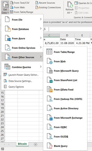
Excel, being a flexible, easy-to-use spreadsheet, is often used to create datasets. It can pull data from external data sources into your spreadsheet with the help of data connection features. It can also obtain data from sources such as the Web, Microsoft Query, SharePoint List, OData Feed, Hadoop Files (HDFS) etc. Consequently, Excel files are often used as a data source for Power BI and Tableau.
Excel是一种灵活,易于使用的电子表格,通常用于创建数据集。 它可以借助数据连接功能将外部数据源中的数据提取到电子表格中。 它还可以从Web,Microsoft Query,SharePoint列表,OData Feed,Hadoop文件(HDFS)等来源获取数据。因此,Excel文件通常用作Power BI和Tableau的数据源。
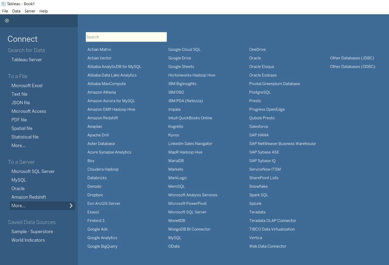
Tableau offers support for hundreds of data connectors including online analytical processing (OLAP) and big data options (such as NoSQL, Hadoop) as well as cloud options.
Tableau支持数百种数据连接器,包括联机分析处理(OLAP)和大数据选件(例如NoSQL,Hadoop)以及云选件。

Power BI is very capable of connecting to a users’ external sources including SAP HANA, JSON, MySQL, and more. It enables users to connect to Microsoft Azure databases, third-party databases, files and online services like Salesforce and Google Analytics.
Power BI非常有能力连接到用户的外部资源,包括SAP HANA,JSON,MySQL等。 它使用户可以连接到Microsoft Azure数据库,第三方数据库,文件和在线服务,例如Salesforce和Google Analytics。
When users add data from multiple sources, Tableau and Power BI determine the relationships automatically. However, Power BI connects limited data sources while increasing its data source connectors in monthly updates.
当用户从多个来源添加数据时,Tableau和Power BI将自动确定关系。 但是,Power BI连接有限的数据源,同时在每月更新中增加其数据源连接器。
2.数据发现 (2. Data Discovery)
Data discovery is a process for detecting patterns and oddity in your data by visually navigating data or applying guided advanced analytics.
数据发现是通过可视化导航数据或应用指导性高级分析来检测数据中的模式和奇数的过程。
While working with Excel, you’re required to have an idea of where the data needs to lead you in order to find critical insights. Options such as Stocks and Geography in Excel help with fetching specifics of the data quickly.
使用Excel时,您需要了解数据需要引导您到哪里才能找到关键的见解。 Excel中的“股票”和“地理”等选项有助于快速获取数据的详细信息。
Tableau and Power BI allow you to freely explore data without knowing the answer you want ahead of time. Using this software, you are able to spot correlations and trends, and then dig down to understand what caused them to happen, rather than the other way around. These systems allow you to understand your data at a glance.
通过Tableau和Power BI,您可以自由浏览数据而无需提前知道所需的答案。 使用此软件,您可以发现关联和趋势,然后深入了解导致它们发生的原因,而不是相反。 这些系统使您一目了然地了解数据。
3.数据模型和适用性 (3. Data models and suitability)
Excel focuses on creating structured and simple data models with a wide range of features and is most suitable for statistical analysis of structured data.
Excel专注于创建具有广泛功能的结构化和简单数据模型,最适合对结构化数据进行统计分析。
Tableau allows you to create a simple data model, such as a single table or it can be more complex, with multiple tables that use different combinations of relationships, joins, and unions. It is most suitable for quick and easy representation of big data which helps in resolving the big data issues.
通过Tableau,您可以创建简单的数据模型,例如单个表,或者可以创建更复杂的数据模型,其中多个表使用关系,联接和联合的不同组合。 它最适合快速,轻松地表示大数据,这有助于解决大数据问题。
Power BI’s data models are focused on data ingestion and building potentially complex data models easily.
Power BI的数据模型专注于数据提取,并轻松构建潜在的复杂数据模型。
4.可视化 (4. Visualizations)
Visualizations are a great way to highlight the data that’s indispensable.
可视化是突出显示必不可少的数据的好方法。
While working with excel for data visualizations, we first manipulate the data that is present and then different charts, graphs are created manually. To make the visualizations easily understandable, you should understand the features of excel well.
在使用excel进行数据可视化时,我们首先处理存在的数据,然后手动创建不同的图表,图形。 为了使可视化易于理解,您应该很好地了解excel的功能。
Users can choose numerous visualizations as blueprints, then insert data from a sidebar into the visualization using Power BI. In addition, it lets users create visualizations by asking queries with natural language. Power BI does place a 3,500 data point limit when it comes to drilling down into datasets to conduct analysis. However, there are a few exceptions to this data point limit: The maximum number of data point limit for R visuals is 1,50,000, for Power BI visuals there is a 30,000 data point limit and for scatter charts there is a 10,000 data points limit.
用户可以选择许多可视化文件作为蓝图,然后使用Power BI将侧边栏中的数据插入到可视化文件中。 此外,它还允许用户通过使用自然语言进行查询来创建可视化效果。 当深入到数据集进行分析时,Power BI确实设置了3500个数据点限制。 但是,此数据点限制有一些例外:R视觉对象的最大数据点限制为1,50,000,Power BI视觉对象的最大数据点限制为30,000数据点,散点图为10,000数据点限制。
Tableau lets users create different types of baseline visualizations, including heat maps, line charts and scatter plots. In addition, users have the ability to ask “what if” questions of the data, as well as the freedom to use any number of data points in their analysis.
通过Tableau,用户可以创建不同类型的基线可视化,包括热图,折线图和散点图。 此外,用户还可以问数据“如果”的问题,并且可以自由地在分析中使用任何数量的数据点。
In addition, Power BI and Tableau allow the users to integrate programming languages like Python, R, etc for creating visualizations.
此外,Power BI和Tableau允许用户集成编程语言(如Python,R等)以创建可视化。
Furthermore, a good API makes it easier to develop a visualization by providing all the building blocks, which are then put together by the programmer. An API consists of a set of subroutine definitions, communication protocols, and tools for building software. Substantially, it is a set of clearly defined methods of communication among various components. Excel, Tableau, and Power BI allow users to amalgamate APIs and leverage the data to create striking visualizations.
此外,良好的API通过提供所有构件,使程序员更容易开发可视化效果。 API由一组子例程定义,通信协议和用于构建软件的工具组成。 实质上,它是一组在各个组件之间明确定义的通信方法。 Excel , Tableau和Power BI允许用户合并API并利用数据创建醒目的可视化。
5.仪表板 (5. Dashboards)
Excel provides limited features to create your dashboard and refreshing it is a tedious process. Tableau and Power BI allow you to create customized dashboards that consist of different types of charts, maps and diagrams. It is easy to refresh your dashboards using Tableau and Power BI and they give their users the ability to create aesthetically pleasing dashboards. When it comes to embedding data, this can easily be done on all three systems, however doing this is a real-time challenge in Tableau as compared to Power BI.
Excel提供了有限的功能来创建您的仪表板,并且刷新它是一个繁琐的过程。 通过Tableau和Power BI,您可以创建由不同类型的图表,地图和图表组成的自定义仪表板。 使用Tableau和Power BI可以轻松刷新仪表板,它们使用户能够创建美观的仪表板。 涉及到数据嵌入时,可以在所有三个系统上轻松完成此操作,但是与Power BI相比,这在Tableau中是一个实时挑战。
6.用户界面 (6. User Interface)
To utilize excel to full potential, macro and visual basic scripting knowledge is required.
为了充分利用excel的潜力,需要具备宏和可视的基本脚本知识。
Tableau and Power BI boast interfaces that don’t require coding knowledge to develop sophisticated and complex visualizations.
Tableau和Power BI拥有不需要编程知识即可开发复杂复杂的可视化效果的界面。
Tableau has an intelligent User Interface and is able to create the dashboards easily. As compared to Power BI, Tableau is a little difficult.
Tableau具有智能的用户界面,能够轻松创建仪表板。 与Power BI相比,Tableau有点困难。
The Power BI interface is very easy to learn. Because of its simplicity, Power BI is often preferred by users.
Power BI界面非常易于学习。 由于其简单性,Power BI通常为用户所偏爱。
7.语言依赖性 (7. Language dependency)
VBA (Visual Basic for Applications) is the programming language of Excel and other Microsoft Office programs. Furthermore, Excel uses MDX to retrieve fields and data values when you choose items from a PivotTable Fields list. MDX queries can also be built manually when you import data from an Analysis Services cube.
VBA(应用程序的Visual Basic)是Excel和其他Microsoft Office程序的编程语言。 此外,当您从数据透视表字段列表中选择项目时,Excel使用MDX检索字段和数据值。 从Analysis Services多维数据集导入数据时,也可以手动构建MDX查询。
But what is MDX? MDX, which stands for Multidimensional Expressions, is a query language for OLAP databases.
但是什么是MDX? MDX代表多维表达式,是OLAP数据库的查询语言。
The software engineers at Tableau use a few programming languages, but the code that comprises the vast majority of the Tableau Desktop is C++.
Tableau的软件工程师使用几种编程语言,但构成Tableau Desktop绝大多数的代码是C ++。
DAX and M are languages that are used in Power BI and are used differently for building Power BI models and are not interdependent. M is a query formula language. M language can be used to view, edit and prepare the data in the Power Query Editor before loading it into the Power BI model. The expressions in M are automatically generated when transformations are done. DAX is an analytical data calculation language. You can use DAX to define custom calculations for Calculated Columns and for Measures (also known as calculated fields), all of which can be further used for in-depth data analysis during the Data View phase. DAX includes some of the functions used in Excel formulas and additional functions designed to work with relational data as well as perform dynamic aggregation.
DAX和M是Power BI中使用的语言,在构建Power BI模型时使用的语言不同,并且不相互依赖。 M是查询公式语言。 在将数据加载到Power BI模型之前,可以使用M语言在Power Query编辑器中查看,编辑和准备数据。 完成转换后,会自动生成M中的表达式。 DAX是一种分析数据计算语言。 您可以使用DAX为“计算列”和“度量”(也称为“计算字段”)定义自定义计算,所有这些都可以在“数据查看”阶段进一步用于深度数据分析。 DAX包括Excel公式中使用的某些功能,以及旨在与关系数据一起使用以及执行动态聚合的其他功能。
8.表现 (8. Performance)
Excel runs on a moderate speed with no option to quicken. Tableau and Power BI also run on moderate speed with options to optimize and enhance the progress of an operation. Power BI is built for the common stakeholder, not necessarily a data analyst. In order to help teams build their visualization, Power BI’s interface depends more on drag and drop and intuitive features. Overall, when it comes to data visualization, Power BI wins for ease of use, but Tableau wins in speed and capabilities.
Excel以中等速度运行,没有选择要加快的速度。 Tableau和Power BI还以适中的速度运行,并具有用于优化和增强操作进度的选项。 Power BI是为普通利益相关者(不一定是数据分析师)构建的。 为了帮助团队建立可视化,Power BI的界面更多地依赖于拖放和直观功能。 总体而言,在数据可视化方面,Power BI在易用性方面胜出,但Tableau在速度和功能方面胜出。
9.数据可用性 (9. Availability of data)
Excel is user specific. However, you can use Power BI to share your Excel workbook with your colleagues.
Excel是特定于用户的。 但是,您可以使用Power BI与同事共享Excel工作簿。
The visualizations created on Tableau can be stored and shared on the Tableau server with other Tableau users.
可以在Tableau上创建的可视化文件可以存储在Tableau服务器上,并与其他Tableau用户共享。
Power BI is focused on reporting and analytical modeling and it allows you to store and share your dashboards by publishing it to a workspace so that everyone can collaborate on it. The storage capacity limits depends on the type of your workspace (Shared or Premium).
Power BI专注于报告和分析建模,它允许您通过将仪表板发布到工作区来存储和共享仪表板,以便每个人都可以在其上进行协作。 存储容量限制取决于工作空间的类型(共享或高级)。
More information on this can be found here.
有关此的更多信息,请参见此处 。
10.产品和定价 (10. Products and Pricing)
Excel is bundled with MS Office tools and can be purchased separately.
Excel与MS Office工具捆绑在一起,可以单独购买 。
Tableau has numerous products such as Tableau Server, Tableau Online, Tableau Public Server, Tableau Desktop, Tableau Public Desktop, Tableau Reader, Tableau Mobile, and Tableau Prep Builder, all of which have different purposes. These products along with their details can be found here.
Tableau具有许多产品,例如Tableau Server,Tableau Online,Tableau Public Server,Tableau Desktop,Tableau Public Desktop,Tableau Reader,Tableau Mobile和Tableau Prep Builder,它们都有不同的用途。 这些产品及其详细信息可以在这里找到。
Using Tableau Public, which is a free software that anyone can connect a spreadsheet to or a file and create interactive data visualizations for the web. Next, we have Tableau Reader which again, is free and allows you to open and interact with the visualizations that are built in Tableau Desktop.
使用Tableau Public,这是一个免费软件,任何人都可以将电子表格连接到文件或文件,并为Web创建交互式数据可视化。 接下来,我们再次提供了Tableau Reader,它是免费的,允许您打开Tableau Desktop内置的可视化文件并与之交互。
You can visit Tableau’s website for further details on their products and pricing.
您可以访问Tableau的网站以获取有关其产品和价格的更多详细信息。
Power BI has a few products as well such as Power BI Desktop, Power BI Mobile, Power BI Report Server, etc. All of their products can be found on their website.
Power BI还有一些产品,例如Power BI Desktop,Power BI Mobile,Power BI Report Server等。所有产品都可以在其网站上找到 。
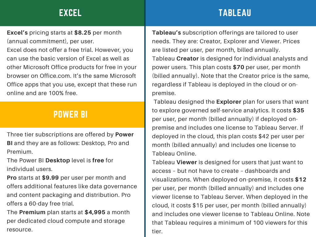
More about the products and their pricing can be found in the table shown below:
有关产品及其价格的更多信息,请参见下表:

Power BI is generally a more affordable option when it comes to pricing. For users who prioritize free trial capabilities, Power BI offers a robust 60-day Pro trial, while Tableau’s free trial is 14 days and the Excel application doesn’t provide a free trial unless it’s paid for. Additionally, Power BI starts at $9.99 per user per month, while Tableau Explorer starts at $35.
就定价而言,Power BI通常是更实惠的选择。 对于优先考虑免费试用功能的用户,Power BI提供了强大的60天Pro试用期,而Tableau的免费试用期为14天,Excel应用程序不提供免费试用,除非付费。 此外,Power BI的起价为每个用户每月9.99美元,而Tableau Explorer的起价为35美元。
最终裁决是什么? (What’s the final verdict?)
After reading the comparison mentioned above for all three systems, it’s time for you to decide what you or your organization require by asking yourself the following questions:
在阅读完上述针对所有三个系统的比较之后,是时候通过询问以下问题来决定您或您的组织的要求了:
- Is your focus more on data processing or data visualization? 您是否更专注于数据处理或数据可视化?
- What kind of reports do you or your organization need? 您或您的组织需要什么样的报告?
- How often will you be creating reports? 您将多久创建一次报告?
- What’s your budget like? 您的预算是多少?
Excel works well for creating quick, one-off reports. Although Excel is a robust tool to use, creating and maintaining repetitive reports, creating visualizations and presentations, and drilling down into granular views of data require some advanced knowledge of its functionality.
Excel非常适合用于创建快速的一次性报告。 尽管Excel是使用的强大工具,但是创建和维护重复的报告,创建可视化效果和演示文稿以及深入研究数据的细化视图仍需要一些其功能的高级知识。
However, choosing one over the other depends on the user’s business size and needs.
但是,选择一个还是另一个取决于用户的业务规模和需求。
Small businesses with limited financial and human resources who are seeking for a more affordable business intelligence solution should start out with Power BI. However, medium and enterprise companies that prioritize data analytics and have the human capital to support them will be better off with Tableau.
财务和人力资源有限的小型企业正在寻求更实惠的商业智能解决方案,应该从Power BI开始。 但是,使用Tableau可以使优先考虑数据分析并拥有人力资本支持它们的中型和企业公司更好。
Keeping business executives in mind, Tableau was created. Its data visualization and self-service functions allow decision makers to pull up a report or dashboard and freely drill down to granular levels of information. The solution can be expensive, but it’s worth the cost if you’re creating many recurring reports that must be updated quickly. If your business creates more one-off reports instead of updating recurring reports, you may want to consider learning Excel’s more advanced features. Tableau allows users to integrate an infinite amount of data points in their analysis and offers comprehensive support options.
牢记业务主管,创建了Tableau。 其数据可视化和自助服务功能使决策者可以提取报告或仪表板,并自由地向下钻取细粒度的信息。 该解决方案可能会很昂贵,但如果要创建许多必须快速更新的定期报表,则值得付出成本。 如果您的企业创建更多的一次性报告而不是更新定期报告,则可能需要考虑学习Excel的更高级功能。 Tableau允许用户在其分析中集成无限数量的数据点,并提供全面的支持选项。
Power BI, Tableau, and Excel don’t work on the same ideologies and principles. So, it is challenging for us to decide which is best. According to our requirements, we can choose the system that we need.
Power BI,Tableau和Excel在不同的意识形态和原则上无法正常工作。 因此,对我们来说确定最佳选择是一项挑战。 根据我们的要求,我们可以选择所需的系统。
I hope that this article, along with the comparison of numerous parameters mentioned above have been helpful for you to decide what you need to invest your time and money in.
我希望本文以及上面提到的许多参数的比较对您确定需要花时间和金钱的方式有所帮助。
Thank you for giving it a read.
感谢您阅读。
翻译自: https://towardsdatascience.com/excel-tableau-power-bi-what-should-you-use-336ef7c8f2e0
tableau大屏bi
本文来自互联网用户投稿,该文观点仅代表作者本人,不代表本站立场。本站仅提供信息存储空间服务,不拥有所有权,不承担相关法律责任。如若转载,请注明出处:http://www.mzph.cn/news/389269.shtml
如若内容造成侵权/违法违规/事实不符,请联系多彩编程网进行投诉反馈email:809451989@qq.com,一经查实,立即删除!


模式—精读《JavaScript 设计模式》Addy Osmani著)
)

详解)


)


